A Guide to Engineering Performance Indicators

Engineering Performance Indicators, or EPIs, are how we measure the health and effectiveness of a software development team. Think of them less as a report card and more as the dashboard in your car—giving you the real-time data you need to see what’s working, spot potential trouble, and make sure you’re heading in the right direction.
They provide a common language for everyone, from engineers to executives, to talk about what success actually looks like.
What Are Engineering Performance Indicators

At its heart, an EPI is a signal. It takes all the complex, messy work of building software and translates it into clear, simple metrics that tell a story about how your team is performing. Without these signals, you’re essentially flying blind, making critical decisions based on gut feelings or anecdotal feedback. EPIs swap that guesswork for clarity.
This data-first mindset is what helps modern software teams stay ahead. It forces us to ask the tough but essential questions:
- Are we actually getting valuable features to our users quickly?
- Is our codebase getting stronger or accumulating more debt?
- What’s really slowing us down? Where are the bottlenecks?
- Are we working together smoothly, or are we tripping over each other?
The Shift from Output to Outcomes
For years, many of us fell into the trap of measuring “vanity metrics”—things like lines of code or number of tickets closed. These metrics tell you if people are busy, but they don’t tell you if they’re building anything that matters.
True engineering performance indicators focus on outcomes, not just output. The goal isn’t to ask, “How much did we do?” but rather, “Did what we do make a difference?” This is a fundamental change in how we think about our work. It’s about taking ownership of the impact we have, using data to get better, and creating a culture where metrics are for learning, not for placing blame.
The Growing Importance of Measurement
As the software world has grown, so has the need for clear, objective measurement. The global engineering services market hit an estimated $2.0 trillion in revenue, driven by huge digital transformation projects. In an industry this massive, tracking things like delivery speed and efficiency isn’t just a good idea—it’s essential for survival.
You can dig deeper into these industry growth statistics on IBISWorld.com. For engineering teams, the takeaway is clear: understanding your performance through data is no longer optional.
The Four Pillars of Engineering Metrics: A Balanced View

When you start digging into engineering performance indicators, the sheer number of available metrics can feel overwhelming. The best way I’ve found to make sense of it all is to group them into four distinct categories.
Think of it like building a structure. You need four strong pillars to keep it stable: Delivery, Quality, Efficiency, and Collaboration. If you focus too much on one—say, delivery speed—at the expense of another, like quality, the whole thing eventually comes crashing down.
When you look at your team’s performance through these four lenses, you get a complete, balanced picture of not just what they’re building, but how they’re building it. Let’s break down each pillar.
Pillar 1: Delivery
The delivery pillar gets right to the point, answering one simple question: “How good are we at shipping valuable software to our users?” These metrics are all about measuring the speed and predictability of your workflow, from the moment an idea is born to when it’s live in production.
The most respected metrics in this category come from the DevOps Research and Assessment (DORA) team. They’ve become the gold standard for a reason—they accurately reflect the performance of truly elite engineering organizations.
- Deployment Frequency: How often does your team push code to production? It’s not about deploying for the sake of it, but about how frequently you can deliver value. Top teams do this on-demand, often multiple times a day.
- Lead Time for Changes: Once a developer commits a piece of code, how long does it take for that change to make it to production? This tells you everything about the health and speed of your entire delivery pipeline.
Tracking delivery metrics gives you a clear window into your team’s agility. If you want to go deeper, we’ve got a whole guide on this. You can learn more about DORA metrics in our detailed guide.
Pillar 2: Quality
Shipping fast is great, but it’s completely pointless if the code is buggy and unreliable. The quality pillar asks the most important question of all: “Is the software we’re shipping stable?”
This is all about the integrity of your product and how well your development process catches issues before they ever reach a customer.
- Change Failure Rate (CFR): What percentage of your deployments goes wrong and causes an issue in production? A low CFR is a direct sign of high-quality releases.
- Mean Time to Recovery (MTTR): When things inevitably break, how fast can your team fix the problem and restore service? This is a crucial indicator of your team’s resilience and problem-solving muscle.
Pillar 3: Efficiency
The efficiency pillar is all about spotting friction in your workflow. It’s designed to answer the question, “Where are we wasting time and energy?” These metrics help you shine a light on bottlenecks, rework, and process headaches that are secretly slowing everyone down.
For instance, Code Churn—how often code gets deleted or rewritten shortly after being committed—can be a sign of fuzzy requirements or deep technical confusion. Another great one is Cycle Time, which measures how long a task is actively being worked on. If cycle times are high, it often means developers are getting stuck somewhere in the process.
By tracking efficiency, the goal isn’t to micromanage or push engineers to “code faster.” It’s about finding and removing the roadblocks that get in their way, creating a smoother and more sustainable workflow for everyone.
Pillar 4: Collaboration
Finally, we have collaboration. No great piece of software was ever built in a vacuum; it’s the result of a team working together seamlessly. This pillar asks, “Are our internal processes actually helping us work together, or are they getting in the way?”
Simple metrics like Pull Request (PR) Size and PR Review Time tell a compelling story. If PRs are consistently massive, they become a nightmare to review, signaling that work needs to be broken down into smaller pieces. And if PR review times are dragging on for days, you’ve found a major bottleneck that’s keeping finished code from getting shipped.
To help you get started, here’s a quick summary of how these four pillars come together.
The Four Pillars of Engineering Performance Indicators
| Pillar | What It Measures | Example Metrics |
|---|---|---|
| Delivery | The speed and predictability of shipping software to users. | Lead Time for Changes, Deployment Frequency |
| Quality | The stability and reliability of the software in production. | Change Failure Rate (CFR), Mean Time to Recovery (MTTR) |
| Efficiency | The amount of friction, waste, or rework in the development process. | Cycle Time, Code Churn, Rework Rate |
| Collaboration | How effectively the team works together to review and integrate code. | PR Review Time, PR Size |
By adopting this four-pillar framework, you ensure you’re not just measuring one aspect of performance but are building a holistic, sustainable, and high-performing engineering culture.
How AI Is Reshaping Engineering Metrics

Artificial intelligence isn’t just another tool in the developer’s belt; it’s fundamentally changing how we measure engineering performance. We’re seeing a brand new category of engineering performance indicators emerge, one that looks past the usual metrics to give us a real picture of how AI is working as a co-pilot for our teams.
For years, we tracked commits and deployments. Now, we can ask much deeper questions. How much time did our team really save by letting an AI assistant handle boilerplate code? Are the prompts our engineers use to solve complex problems actually effective? AI is starting to turn these once-fuzzy observations into hard data.
From Manual Tracking to Intelligent Insights
The real game-changer here is the move away from metrics we have to manually pull and piece together. Instead, we’re getting automated, intelligent signals that provide a much richer story. Modern tools can plug into your entire development ecosystem—from the IDE and Git to Jira—and start spotting patterns or predicting roadblocks before they ever slow you down.
This opens up a completely new level of analysis. We can finally see which AI tools genuinely speed up development and which ones are just creating more noise. We can even start to track “AI-Assisted Throughput,” a powerful new metric that shows just how much faster developers are shipping code with AI’s help compared to their previous baseline.
Proving the Value of Your AI Co-Pilot
One of the biggest headaches for engineering leaders is justifying the investment in AI. It’s easy to buy the tools, but it’s a lot harder to prove they’re making a difference. This is exactly where AI-specific EPIs come in.
At its heart, this is all about measuring the effectiveness of the human-AI partnership. AI isn’t here to replace developers—it’s here to amplify their skills. The right metrics help us see how well that partnership is working and where we can make it even better.
New kinds of metrics are popping up to measure this dynamic:
- AI Refactor Efficiency: How often are AI-suggested code refactors actually accepted? And do they lead to measurable improvements in code quality?
- AI Adoption Rate: What percentage of your team is actively using AI coding assistants every day?
- Prompt Success Rate: This one is crucial. It looks at how often a developer’s prompt to an AI tool generates code that’s actually usable, highlighting who might need a bit of training on prompt engineering.
Having this data is more important than ever. A recent report on engineering trends found that while 61% of companies are pumping more money into AI, only 20% are using specific metrics to see if it’s paying off. You can explore the full software engineering management trends report on Jellyfish.co to get a better sense of that gap.
By bringing these AI-focused indicators into your process, you can draw a straight line from your investment to real-world outcomes. To see what this looks like day-to-day, you can learn more about AI code review processes in our guide.
Choosing Metrics That Actually Empower Your Team
There’s no magic, one-size-fits-all list of engineering performance indicators. The most powerful metrics aren’t pulled from some generic template; they’re thoughtfully chosen to reflect what your team is actually working on, the challenges you face, and the goals you’re aiming for. The whole point is to build a measurement system that gives you real insight and helps your team get better, not one that just polices their every move.
It all starts by connecting your metrics to what the business actually cares about. If you skip this step, you’ll end up tracking numbers that look great on a dashboard but don’t move the needle on what matters. Every single indicator you track has to have a clear and direct purpose.
Start With Your North Star Goal
Before you even start thinking about specific metrics, you need to figure out your team’s “North Star.” What’s the single most important thing you’re trying to accomplish right now? Is it shipping features faster? Making the product more stable? Or maybe it’s finally time to tackle that mountain of technical debt? This big, central goal is your compass.
Once you have your North Star, you can pick two or three supporting metrics that directly show if you’re making progress. For instance, if your North Star is to “ship features faster,” you might choose:
- Lead Time for Changes: This tells you the full, end-to-end speed of your delivery pipeline.
- Deployment Frequency: This tracks how often you’re actually getting value into the hands of users.
- Cycle Time: Perfect for finding—and fixing—the bottlenecks inside your development process.
This focused approach stops you from getting lost in a sea of data. It ensures every metric you track is one you can actually do something with. If you need more ideas, you can explore a whole range of software engineering productivity metrics in our detailed guide to find the right ones for your team’s specific goals.
Good EPIs vs. Vanity Metrics
One of the easiest traps to fall into is getting obsessed with vanity metrics. These are the numbers that are simple to measure but often tell the wrong story—things like lines of code written or the raw number of commits. They give you a false sense of productivity without ever touching on actual value.
Good EPIs, on the other hand, are all about outcomes. They tell a story about how effective your team is and give you clues on where to improve. They help you understand the “how” and “why,” not just the “what.”
A good metric starts a conversation about how to get better. A vanity metric ends that conversation with a number that means nothing on its own, rewarding busywork over real impact and often encouraging the exact opposite of what you want.
Distinguishing between meaningful metrics and distracting ones is critical. Here’s a quick comparison to help you tell them apart.
Good EPIs vs. Vanity Metrics
| Characteristic | Good EPI (e.g., Cycle Time) | Vanity Metric (e.g., Lines of Code) |
|---|---|---|
| Focus | Measures outcomes and real impact on value delivery. | Measures raw output and activity levels. |
| Behavior | Encourages teamwork and fixing the process itself. | Drives individual busywork, sometimes at the cost of quality. |
| Insight | Shines a light on bottlenecks and ways to improve the whole system. | Lacks context and can be easily gamed or manipulated. |
| Goal | To understand and improve the health of the entire workflow. | To create a simple, but often misleading, score for individual performance. |
When you choose metrics that point directly at your North Star and focus on outcomes instead of just output, you build a system that genuinely helps your team do their best work.
Your Playbook for Measuring and Reporting Performance
Turning theory into practice is where the real magic of engineering performance indicators happens. A solid playbook for measuring and reporting ensures your metrics program becomes a source of empowerment, not anxiety. It’s all about creating a rhythm of data-driven conversations that spark genuine improvement.
This journey begins with getting your data collection on autopilot. Manually yanking data from Git, Jira, and your CI/CD pipeline is a surefire path to burnout and messy, inconsistent reports. This is where engineering intelligence platforms become indispensable. They plug into your existing toolchain and do all the heavy lifting, gathering and organizing the data for you.
Step 1: Automate Data Collection and Visualization
First things first, you need to get all your data into one place where it can tell a coherent story. Instead of juggling spreadsheets, you need a single source of truth. Tools like Zest can consolidate every task, tool, and minute into a unified feed, turning raw activity into clear, actionable signals without any manual grunt work.
This automation frees your team from the tedious chore of data wrangling, letting them focus on what the metrics are actually saying.
But collecting the data is only half the battle; how you see it is just as important. A well-designed dashboard should make trends and outliers pop, helping your team spot patterns without needing to be data scientists.
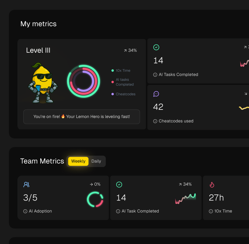
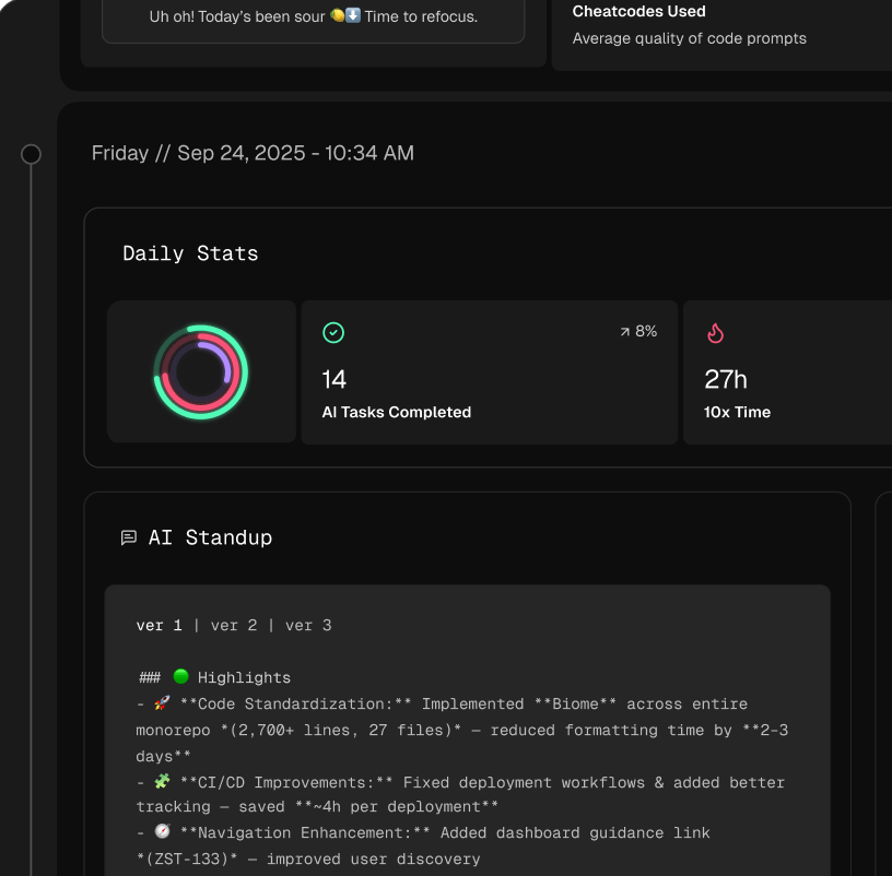
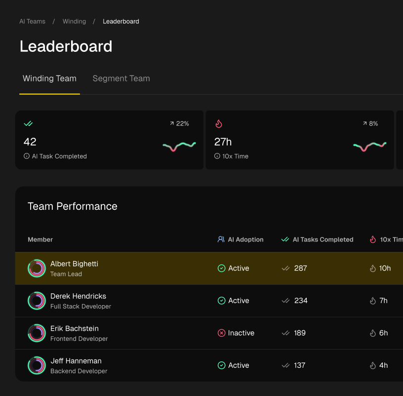
Here’s an example of what that looks like in practice—a clean dashboard that makes engineering data easy to digest.
This kind of view allows teams to move beyond raw numbers and see the narrative behind their performance, like how cycle times are trending over a quarter.
Step 2: Build a Culture of Transparency and Learning
With your data visible and accessible, the next step is all about culture. This is crucial. Metrics should never, ever be used to assign blame or rank individuals. The moment they become a weapon, trust evaporates, and the entire program is doomed to fail.
Instead, frame your EPIs as tools for collective learning and, yes, celebration. Here’s how to do it:
- Share Widely: Make dashboards visible to everyone. When everyone sees the same data, it builds trust and encourages people to take ownership of the outcomes.
- Focus on ‘Why’: When a metric dips, the first question should always be “Why?” not “Who?” This simple shift moves the conversation from blame to root cause analysis.
- Celebrate the Wins: When you see a positive trend—like a drop in your Change Failure Rate—dig into what the team did to make it happen. Share those learnings so everyone can benefit.
The goal is to create an environment of psychological safety where data is used to illuminate problems with the system, not with the people working in it.
Step 3: Run Effective Performance Conversations
Reviewing your metrics regularly is essential, but how you review them is what truly matters. Avoid knee-jerk reactions to a single data point and focus on telling a story over time.
A productive performance conversation, whether it’s a team retrospective or a one-on-one, should follow a few simple ground rules:
- Look at Trends, Not Points in Time: A single bad week for Deployment Frequency is just a blip. A steady decline over a quarter? Now that’s a trend worth investigating. Always zoom out to see the bigger picture.
- Connect Metrics to Initiatives: Don’t discuss metrics in a vacuum. Tie them directly to what the team is actually doing. For example, “Our Cycle Time improved by 15% last month. It looks like that initiative to reduce PR size is really paying off.”
- Ask Open-Ended Questions: Use the data as a launchpad for a real conversation. Ask things like, “What do you think is contributing to this trend?” or “What obstacles are getting in our way here?”
This approach turns reporting from a chore into a powerful tool for continuous, collaborative improvement.
Common Pitfalls and How to Avoid Them

Rolling out engineering performance indicators can feel like a massive leap forward. But if you’re not careful, this well-intentioned move can backfire and seriously damage your team’s culture. It’s surprisingly easy to fall into a few common traps that turn helpful data into a source of anxiety and mistrust.
The key is to remember what these metrics are for: they’re tools for learning and improvement, not for judgment. They exist to shine a light on systemic problems and celebrate collective wins. By understanding the pitfalls from the get-go, you can build a system that actually supports your team and makes everyone’s work better.
Pitfall 1: Weaponizing Metrics
This is the number one mistake, and it’s the most dangerous. It’s what happens when leaders use data to punish individuals or create internal league tables.
-
What it looks like: A manager sees one developer’s Cycle Time is lagging behind the team average. They call that person out in a team meeting. The result? A culture of fear where everyone starts gaming the system just to make their numbers look good.
-
How to fix it: Make it a golden rule: metrics are never tied to individual performance reviews. Period. Instead, use the data as a starting point for a supportive, private chat. Try asking, “I noticed our cycle times are creeping up. Are there any blockers getting in the team’s way that I can help with?” This frames the metric as a signal about the process, not the person.
Pitfall 2: Focusing on Individual Output
Obsessing over individual stats like “commits per week” or “lines of code” completely misses the point. Great software is built by teams, not lone wolves, and your metrics need to reflect that reality.
-
What it looks like: Developers are rewarded based on how many story points they complete individually. This encourages people to rush, skip crucial code reviews, and ignore teammates who need help—because helping someone else won’t boost their personal stats.
-
How to fix it: Always prioritize team-level outcomes. Stick to metrics from the four pillars, like Lead Time for Changes or Change Failure Rate, which measure the health of the entire delivery pipeline. This fosters a sense of collective ownership and makes it clear that the team sinks or swims together.
Pitfall 3: Ignoring the Context
Numbers don’t tell the whole story. A sudden dip in Deployment Frequency might look bad on a dashboard, but it could be because the team is heads-down tackling a huge, complex piece of technical debt that will pay off massively down the line.
Metrics provide the “what,” but your team provides the “why.” Ignoring the context behind the data leads to flawed conclusions and erodes trust.
-
What it looks like: An exec sees one month of low Deployment Frequency and immediately assumes the team is slacking. They start applying pressure without ever asking why things slowed down.
-
How to fix it: Always, always talk about the metrics with your team. Use your dashboards as conversation starters in retrospectives to get the story behind the numbers. This collaborative approach turns raw data into real, actionable insights and makes sure everyone feels seen and understood.
Frequently Asked Questions
Diving into engineering metrics often brings up more questions than answers at first. Here are some of the most common ones we hear from teams just starting out.
How Do We Start Without Overwhelming Everyone?
The trick is to start small. Don’t try to boil the ocean by tracking a dozen metrics at once. Instead, pick just one or two that speak directly to a current team goal. For example, if stability is a problem, start by tracking your Change Failure Rate.
Make sure you explain the why behind the metric. Frame it as a tool to help the team improve together, not as a way to micromanage. Automate the data collection right away to avoid adding manual work, and use your retros to talk about the trends you’re seeing. A slow, deliberate rollout builds trust and makes the whole process feel helpful instead of heavy.
Will These Indicators Work for Different Kinds of Teams?
Absolutely, but you have to tailor them. The core ideas—delivery, quality, efficiency, collaboration—are universal, but the specific engineering performance indicators you pick must fit what the team actually does.
A product team, for instance, might be obsessed with metrics like Lead Time for Changes and how quickly they can ship new features to customers. On the other hand, an infrastructure team will probably care more about system reliability—think Mean Time to Recovery (MTTR), uptime, and how many other teams are adopting their internal tools. The key is to adapt the framework to what “high performance” means for that specific group.
How Often Should We Be Looking at Our Metrics?
It really depends on the metric. Your review schedule should match the natural rhythm of the work you’re measuring.
Fast-moving operational metrics, like Deployment Frequency, are great to look at weekly in team meetings. They can help you spot immediate blockers or interesting patterns. For more strategic, slow-burn indicators like Cycle Time, a bi-weekly or even monthly review works better. You need more time to see meaningful trends emerge. The goal isn’t just to report numbers; it’s to create a consistent habit of having data-informed conversations that lead to real improvements.
Ready to turn engineering data into real insights without all the manual grunt work? Zest automatically gathers and visualizes the metrics that actually matter, freeing up your team to focus on getting better, not just building reports. Get started with Zest today.
Master Your Engineering Metrics
Turn raw engineering data into actionable team insights with this practical scorecard.
📊 Core Metrics
- Lead Time for Changes — Measures end-to-end delivery speed, from commit to production.
- Change Failure Rate — Tracks the percentage of deployments that cause a production failure.
- Cycle Time — Identifies bottlenecks by measuring active development time on tasks.
🕹️ My Cheatcodes
- 🌱 Outcomes over Output — Focus on metrics that measure value (like stability), not busywork (like lines of code).
- 🦎 Context is King — Always discuss the "why" behind the numbers with your team, never just the raw data.
- ⚡ System, Not People — Use metrics to diagnose issues with the process, never to judge individual performance.
✅ Before You Measure
- 🔍 Define your "North Star" goal first
- 📊 Automate all data collection
- 🧭 Prioritize team-level metrics
- 📈 Establish a regular review cadence
Gallery
Lemon shots