Calculating Cycle Time to Uncover and Fix Bottlenecks

If you want to understand how fast your software team really is, you need to calculate cycle time. In simple terms, it’s the total time that passes from the moment work starts on a task until it’s officially done. For most development teams, this means starting the clock on the first code commit and stopping it when that code is live in production.
This one measurement gives you a crystal-clear picture of your development pipeline’s speed and efficiency.
Why Cycle Time Is Your Most Powerful Metric
We’ve all been there: slow delivery pipelines are a huge source of frustration. Features get stuck in limbo, deadlines feel like suggestions, and no one can pinpoint the actual bottleneck. Instead of guessing or relying on abstract measures like story points, cycle time gives you a concrete, data-driven look into your team’s real-world performance.
Think of it less as a number and more as a diagnostic tool. A consistently high cycle time is almost always a symptom of deeper problems that quietly drain your team’s productivity.
Uncovering Hidden Friction Points
When you start calculating cycle time, you can finally put a number on those all-too-common development frustrations. These aren’t just minor annoyances; they are real, measurable delays that directly impact your ability to get valuable software into your users’ hands.
Some of the most common issues that drive up cycle time include:
- Long-running pull requests: Code that sits for days waiting on a review is pure dead time.
- Merge conflicts and rework: The longer a branch exists, the more complex and painful the eventual merge becomes.
- Flaky test suites: When tests are unreliable, developers lose trust and resort to manual workarounds, which slows everything down.
- Manual deployment processes: A lack of automation is a recipe for unnecessary delays and human error.
These problems aren’t just theoretical. A 2022 survey from Retool found that a shocking 40% of developers need one to two weeks just to get their code to customers. The biggest culprits were waiting on machines (42%), waiting on people (38%), wrestling with merge conflicts (34%), and dealing with flaky tests (41%). These are all direct contributors to a bloated cycle time.
You can learn more about these common engineering bottlenecks from software developer statistics for 2023.
By focusing on cycle time, you shift the conversation from “Are we busy?” to “Are we delivering value effectively?” It connects daily engineering work directly to business outcomes.
To help you spot these issues in your own workflow, here’s a quick rundown of where things often get stuck.
Common Cycle Time Bottlenecks at a Glance
| Bottleneck Category | Common Examples | Impact on Cycle Time |
|---|---|---|
| Code Review & Feedback | Pull requests sitting idle, reviewers unavailable, vague feedback requiring rework. | Days can be added while code waits for human attention. This is often the largest source of delay. |
| CI/CD Pipeline | Slow build times, flaky or unreliable tests, complex manual approval gates. | Hours of wasted time per commit, creating a “hurry up and wait” culture. |
| Merge & Integration | Large, long-lived branches, frequent and complex merge conflicts. | Significant engineering time is spent resolving conflicts instead of building new features. |
| Deployment Process | Manual deployment steps, lack of a staging environment, rollbacks due to errors. | The final step to production becomes a high-stress, time-consuming event that people avoid. |
Recognizing these patterns is the first step.
Ultimately, tracking this metric is the foundation for building a faster, more predictable delivery process. It’s one of the core DevOps performance metrics that separates the high-performing teams from everyone else. This guide will walk you through exactly how to start measuring it accurately.
Defining Your Start and End Points for Accurate Measurement
Before you can even think about calculating cycle time, your team has to get on the same page about one critical detail: what, exactly, are you timing? If you don’t have a shared definition, your data will be all over the place and, frankly, useless. The first real step is to establish clear, universally understood start and end points for your workflow.
This decision fundamentally shapes the story your metrics tell. Are you trying to measure the raw speed of coding and review? Or are you more interested in the entire journey, from the moment an idea is logged to when it’s in a customer’s hands? Both are perfectly valid, but they measure very different things.
Choosing Your Measurement Scope
The boundaries you set depend entirely on what you want to improve. A fast-moving startup might zero in on the time from first commit to merge, because that’s a pure reflection of engineering velocity. A larger enterprise team, on the other hand, might need a bird’s-eye view, tracking the process from ticket creation to production deployment to see the whole system at work.
There’s no single right answer here, but consistency is everything. Whatever you choose, everyone on the team has to stick to it for every single piece of work.
Common start and end points often fall into two camps:
- Feature-Focused View (Narrow): This isolates the core development cycle.
- Start: First commit on a feature branch.
- End: Pull request merged to the main branch.
- Value-Stream View (Broad): This measures the full journey from concept to customer.
- Start: Ticket or user story created in the backlog.
- End: Code successfully deployed to the production environment.
The key is to pick a scope that shines a light on your team’s biggest headaches. If code reviews are a known bottleneck, measure the commit-to-merge window. If it’s the planning and handoffs that are slowing you down, you need to measure the full ticket-to-deploy lifecycle.
Why Context Matters
Let your team’s context be your guide. A team working on a mature, complex product with a rigid release process will have totally different priorities than a small team spinning up a new feature from scratch. The broader you make your definition, the more you’ll learn about the time spent in handoffs—like the lag between a developer saying “it’s done” and QA actually starting their work.
This is where cycle time bumps up against its close cousin, lead time. While cycle time zooms in on the active “work in progress” phase, lead time typically captures the whole shebang, from the customer’s initial request to its final delivery. For a deeper dive into this distinction, check out our guide on lead time in software development.
Ultimately, your goal is to land on a measurement that is both meaningful and actionable. Once your team has aligned on these start and end points, you can move forward with confidence, knowing you’re measuring something that truly matters. This shared understanding is the bedrock of any real effort to improve your workflow.
The Core Formulas for Calculating Cycle Time
Alright, once you’ve nailed down your start and end points, it’s time to do some simple math. Don’t worry, we’re not talking about complex algorithms here. These are straightforward formulas that tell a powerful story about your workflow. We’ll start with the basics and work our way up to the metrics that really move the needle for high-performing teams.
The most common starting point is the Mean, or average, cycle time. It gives you a single number to represent your team’s typical speed. While it’s a bit of a blunt instrument, it’s a decent place to get a foundational baseline.
Calculating the Mean (Average)
To get the average, you just add up the cycle times for all the tasks you finished in a specific period and then divide by the number of tasks.
Formula: Mean Cycle Time = (Total of all individual cycle times) / (Number of tasks)
So, if you knocked out three tasks that took 2 days, 3 days, and 7 days, your average cycle time is (2 + 3 + 7) / 3 = 4 days. It’s quick, easy, and gives you a general sense of your team’s pace.
When to use the Mean: The average is perfect for a quick, at-a-glance health check. It’s useful for high-level reports or tracking a single number week-over-week. Just be careful—it can be seriously misleading.
Using the Median for a More Realistic View
Here’s the problem with averages: they’re incredibly sensitive to outliers. That one monster task that took three weeks can pull your average way up, making your whole team look slower than you actually are. That’s where the Median is your best friend.
The median is simply the middle value when you line up all your cycle times in order. It chops off the extreme highs and lows, giving you a much truer picture of a “typical” task.
Using our last example (2, 3, 7 days), the median is just 3 days. See how that feels more representative than the average of 4? If you have an even number of tasks, just take the average of the two middle numbers.
When to use the Median: Use the median to understand the real experience of a typical piece of work. It’s far more reliable than the average for setting realistic expectations with stakeholders.
Why Percentiles Are the Gold Standard
If you’re serious about predictability, you need to be looking at Percentiles. A percentile tells you the value below which a certain percentage of your data falls. For example, your 85th percentile cycle time is the maximum time it takes to complete 85% of your tasks.
This is where the magic happens. It lets you make promises you can actually keep.
If your 85th percentile is 10 days, you can confidently tell your stakeholders, “We can deliver this kind of work in 10 days or less, 85% of the time.” That’s a powerful, data-backed forecast, not just a gut feeling. It’s a game-changer for building trust.
With the global developer population projected to surpass 27 million, making workflows efficient in major markets like the US and India is more critical than ever. According to the CHAOS Report, a staggering 31% of projects fail to finish on time and on budget. A major culprit? Unclear requirements, which can inflate cycle times by up to 52%. You can discover more insights about these software development statistics and see why data matters. Using percentiles is your best weapon against that kind of unpredictability.
When to use Percentiles: Use the 85th or 95th percentile for solid forecasting and setting dependable service-level expectations (SLEs). This is the best metric we have for answering that crucial question, “When will it be done?” with real confidence.
Handling Real-World Complexity in Your Calculations
Formulas are clean. Development pipelines? Not so much. If you want to calculate cycle time accurately, you have to embrace the messy reality of software development. Ignoring the complexities won’t make them go away—it just leads to misleading data that hides the very problems you’re trying to solve.
The goal isn’t just to get a number; it’s to get a number that reflects what’s actually happening on the ground. This means having a clear strategy for all the common curveballs: work that bleeds across sprints, tasks blocked by outside forces, and code that gets sent back for a do-over.
This infographic breaks down the core formulas, moving from a simple average to more predictive percentile-based measurements.
Think of each formula as a different lens. Together, they give you a much more complete picture of your team’s delivery speed and, just as importantly, its consistency.
Dealing with Work-in-Progress and Blockers
One of the first questions I always get is how to handle work-in-progress (WIP) that carries over from one week to the next. Do you count it? My advice is simple: only measure items that are fully completed within your chosen period. This is the only way to keep your dataset clean and consistent, since the final cycle time for ongoing work is still a big question mark.
Another huge disruptor is “blocked” time. What do you do when a task is stuck waiting for an API key from another team or a final decision from product? It’s tempting to subtract that time. Don’t.
Blocked time is a real part of your process and often a massive source of delay. You absolutely should not subtract it from your calculations. Including it forces a conversation about systemic dependencies and pushes the team to find ways to resolve them.
Accounting for Rework Loops
And what about features that get bounced back from QA or, worse, fail in production and require rework? These “rework loops” are a critical, non-negotiable part of your cycle time. If a task starts on Monday, goes to QA on Wednesday, gets kicked back on Thursday, and is finally deployed the following Tuesday, the entire duration counts.
The time spent on rework directly reflects quality issues or communication gaps. Excluding it just paints an overly optimistic—and completely inaccurate—picture of your workflow’s health.
Breaking Down Multi-Stage Workflows
If you want to get really granular, you can calculate cycle time for individual phases of your workflow. Instead of just one big number from commit-to-deploy, you can measure the sub-stages to find out where the real friction is.
- Coding Time: First commit to pull request creation.
- Code Review Time: PR creation to merge.
- QA Time: Merge to QA sign-off.
- Deployment Time: QA sign-off to production release.
When you break down the process like this, you can pinpoint exactly where things are slowing down. It’s a powerful diagnostic tool for identifying your true bottlenecks, not just the ones you think you have.
Even with the best processes, developers are constantly interrupted. An Infragistics study found that developers spend only 43% of their time actively coding. While remote work has helped, 40% of features still take one to two weeks to ship, often held back by flaky builds and complex merges. Digging into the full research about these software development challenges shows how these issues directly impact delivery. The key to making your cycle time metrics meaningful is to face these real-world complexities head-on.
Ditch the Spreadsheets: Automating and Visualizing Cycle Time with Modern Tools
If you’re still tracking cycle time in a spreadsheet, you’re doing it wrong. Let’s be honest, manual data entry is a soul-crushing task. It’s slow, full of errors, and by the time you’ve crunched the numbers, the data is already stale. You’re always looking in the rearview mirror.
To get ahead of the curve and actually improve your cycle time, you need tools that automate the grunt work. Modern platforms plug directly into your daily workflow—think Git, Jira, or whatever project management software for engineers you’re using. They pull the data automatically, in real-time, without anyone having to lift a finger. This is the only way to get a live, accurate picture of what’s really happening.
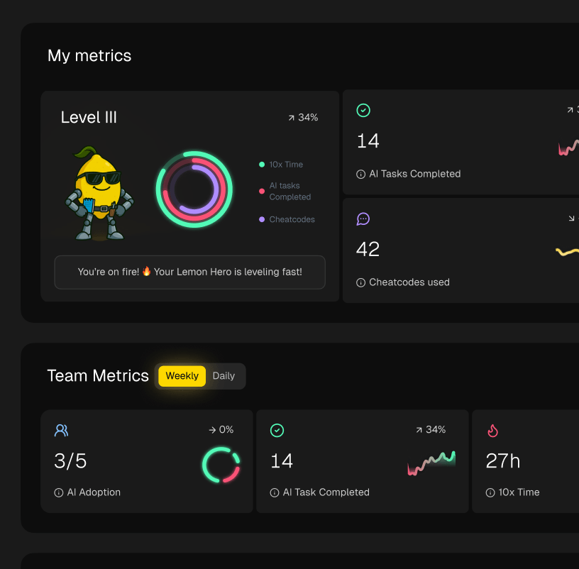
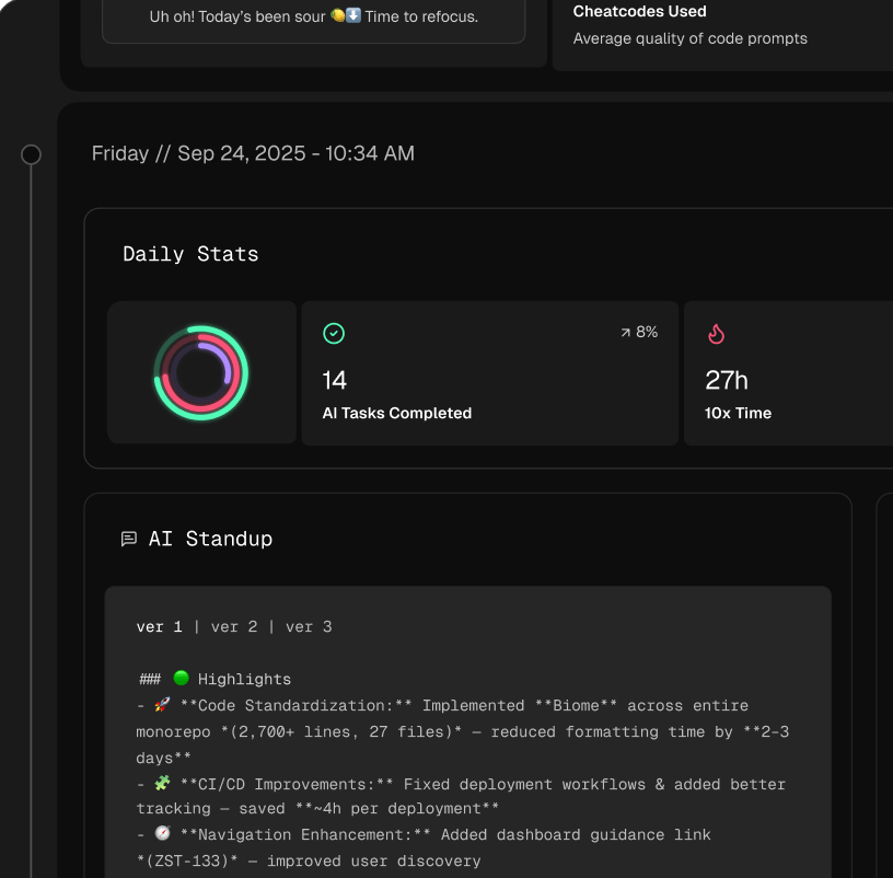
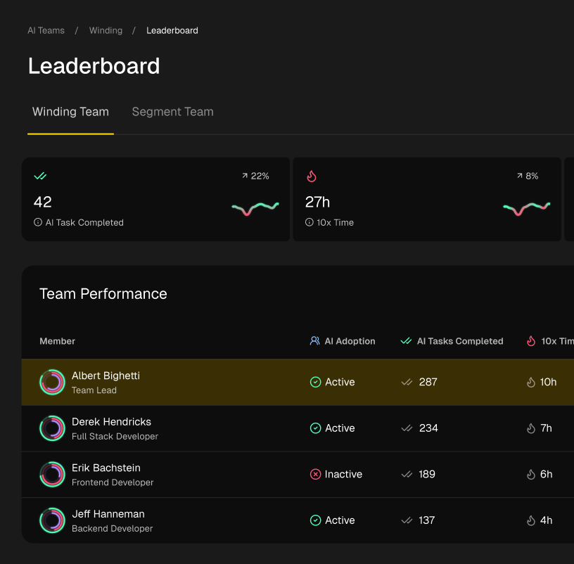
This kind of automated data feed is the foundation for visualizations that actually mean something. For instance, a dashboard like the one from Zest can turn a chaotic stream of development activity into a clear, understandable story of your team’s workflow.
Suddenly, you can spot a bottleneck or see a win at a glance, instead of spending an hour digging through rows and columns of data.
Bringing Your Data to Life with Visualizations
Raw numbers on their own are pretty useless. A chart, on the other hand, can tell you a story. When it comes to cycle time, there are two visualizations I always come back to: Scatterplots and Control Charts.
- Cycle Time Scatterplots: This is my go-to. Each finished task gets plotted as a dot, showing when it was completed and how long it took. It’s the quickest way to see the outliers—those one or two tasks that took forever—and spot if your cycle time is generally trending up or down.
- Control Charts: These take your scatterplot data and layer on lines for the average and standard deviation. This chart answers a critical question: is our process stable or is it pure chaos? If most of your dots are clustered between the control limits, you’ve got a predictable system.
These charts shift the conversation from “why did this one task take so long?” to “is our overall system healthy?” That’s a much more productive discussion.
Getting Deeper Insights with Integrated Tools
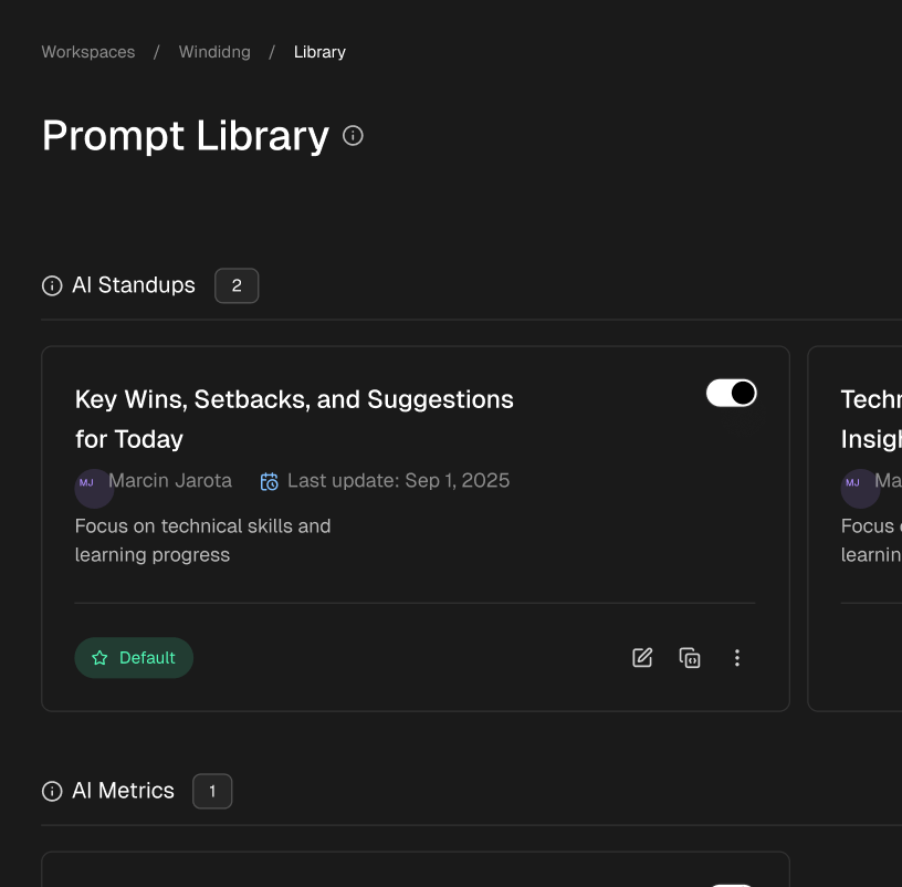
The best tools don’t just stop at Jira. Some, like Zest, pull data directly from a developer’s IDE, consolidating every single action into one feed. This gives you an incredible level of detail. You can pinpoint exactly where time is being lost, identify which AI prompts are causing rework, and even find and share clever solutions—what I call “cheatcodes”—with the rest of the team.
Of course, solid tooling goes hand-in-hand with solid processes. Implementing strong CI/CD pipeline best practices is fundamental for any team serious about automating their delivery and getting faster feedback.
It’s no secret that teams are feeling the pressure. Recent data shows that workload management (26.2%) and project hurdles (26.1%) are the biggest headaches for developers. As a result, a massive 76.8% of firms are turning to low-code solutions to ease the burden and speed things up. The right tool doesn’t just measure the problem; it actively helps you solve it.
By automating data collection and using clear visualizations, you free up your team’s mental energy to focus on what really matters: analyzing the trends and making targeted improvements to your workflow.
Ultimately, you want to create a tight feedback loop where real-time data informs how you work tomorrow. This is where a good tool becomes more than just a dashboard—it becomes a driver of genuine performance improvement.
Your Action Plan to Improve Cycle Time This Week
All this data is great, but insight is useless until you act on it. Now that you know how to calculate cycle time, you can start making real improvements. This doesn’t have to be some huge, drawn-out initiative. You can make a dent this week with a clear, focused plan.
The main takeaways are pretty simple: define your workflow, focus on percentiles instead of just averages, and get your data collection on autopilot for a real-time view. Turning these ideas into practice just takes a bit of structure.
Your Immediate Next Steps
Before you can fix anything, you have to know what’s broken. If you need a deeper dive into recognizing inefficiencies, this guide on identifying and fixing broken product development cycles is a great resource for spotting where to focus your energy.
Here’s a simple checklist to get the ball rolling:
- Get on the Same Page: Book a quick meeting and get everyone to agree on the exact start and end points for your cycle time. This is non-negotiable—consistency is everything.
- Pick Your North Star Metric: Decide which percentile you’ll use to measure predictability. The 85th percentile is usually a solid choice.
- Automate Your Data: Hook up a tool that pulls data from your systems automatically. Manual tracking is a recipe for failure.
- Set a Rhythm for Review: Put a recurring 30-minute meeting on the calendar to look at trends, not to micromanage individual tasks.
Frequently Asked Questions About Cycle Time
Once you start tracking cycle time, a few questions always seem to surface. It’s totally normal, and getting everyone on the same page is key to making the metric a tool for improvement, not just another number to track.
Let’s walk through the most common questions I hear from teams. The goal here is to get past the numbers and into a real conversation about making work flow better.
What’s the Difference Between Cycle Time and Lead Time?
This is easily the most common point of confusion, but it’s simple when you break it down.
Cycle Time is all about the active development phase. Think of it as the “hands-on keyboard” time. The clock starts ticking when a developer pulls the ticket and makes that first commit, and it stops when their code is live in production.
Lead Time, on the other hand, captures the entire customer journey from start to finish. It begins the moment an idea is logged or a ticket is created and only ends when the solution is actually in the customer’s hands. Lead Time includes all the “wait time” before development even begins, giving you a much broader view of your entire process.
How Often Should We Be Looking at Our Cycle Time?
This is a balancing act. Look too often, and you risk micromanaging every little blip. Wait too long, and the data becomes stale and useless.
For most teams I’ve worked with, a weekly review hits the sweet spot.
A weekly check-in is frequent enough to catch new bottlenecks or patterns before they snowball into bigger issues. It also helps you avoid panicking over a single slow day, instead focusing the team on the overall health of the workflow.
The point of checking metrics isn’t to point fingers. It’s a team huddle to ask, “What’s getting in our way, and what can we do about it together?”
So, What’s a Good Cycle Time for a Software Team?
Honestly, there’s no magic number. A “good” cycle time is completely dependent on your team, your product, and what you’re trying to achieve.
A startup racing to build a new feature might be aiming for a 1-2 day cycle time. But for a team maintaining a massive, complex enterprise system, a 7-day cycle time might be fantastic.
Instead of chasing some arbitrary industry benchmark, focus on stability and predictability. A good cycle time is one that’s consistently low for you and doesn’t swing wildly from one ticket to the next. The real goal is to continuously improve against your own baseline.
Master Cycle-Time Calculations
Turn messy development data into clear, actionable insights about your team's delivery speed.
📊 Core Metrics
- Mean Cycle Time — The simple average, best for a quick high-level snapshot.
- Median Cycle Time — The middle value, providing a realistic view of a typical task.
- 85th Percentile — The gold standard for predictable forecasting and setting reliable expectations.
🕹️ My Cheatcodes
- 🌱 Measure Complete Work Only — Exclude work-in-progress from period calculations for clean data.
- 🦎 Never Subtract Blocked Time — Treat external dependencies as part of the process to expose system-level bottlenecks.
- ⚡ Segment Your Workflow — Calculate cycle time for individual stages (e.g., code review, QA) to find the real friction.
📈 Reflection Points
- 💡 Is our current cycle time metric skewed by a few unusually large tasks?
- 🧩 Where do tasks spend the most time waiting for someone or something else?
- 📘 Are we treating rework as a data point for improving quality, or just an inconvenience?
Gallery
Lemon shots