A Guide to Agile Development Metrics for Modern Teams
Agile development metrics are the compass for any modern software team. They give you hard data on your speed, quality, and the actual value you’re shipping. Instead of relying on guesswork, these metrics offer a clear, objective window into the health of your development process, making it much easier to spot bottlenecks and get better over time.
Why Agile Development Metrics Matter
Trying to understand your development process without data can feel like you’re lost in a fog. Agile metrics are the tools that clear that fog. They aren’t meant to be rigid report cards for judging individual performance; think of them more like a real-time dashboard for your entire engineering team. This dashboard shows you your speed, your engine health, and where you’re headed. Without it, you’re flying blind.
The massive shift to agile practices really drives home the need for this kind of objective measurement. A recent study found that a whopping 86% of software development teams have gone agile. What’s more, engineering and R&D teams are adopting it faster than anyone, jumping to 48% in 2023—that’s a 16% increase from the year before, according to the 17th State of Agile report. This trend highlights something crucial: as more teams embrace agile, the need for clear, actionable metrics to guide them becomes undeniable.
The Three Pillars of Measurement
To keep from getting overwhelmed by all the different metrics out there, it helps to group them into three main categories. These pillars—Flow, Quality, and Value—give you a balanced, holistic view by answering a fundamental question about your development process.
Let’s break them down.
The Three Pillars of Agile Metrics
| Metric Category | Core Question Answered | Example Metrics |
|---|---|---|
| Flow | How smoothly and quickly is work moving from idea to delivery? | Lead Time, Cycle Time, Throughput, Work in Progress (WIP) |
| Quality | Are we building the right thing, and are we building it well? | Code Churn, PR Review Time, Defect Escape Rate |
| Value | Does our work actually matter to our customers and the business? | Time Saved, Prompt Effectiveness, Session Friction |
This framework ensures you’re not just chasing speed at the expense of stability, or vice versa. It’s about creating a balanced system.

The map above shows how these three pillars form the foundation of a solid metrics strategy. When you balance all three, you build a truly healthy engineering organization.
Embracing these pillars helps you move from vague feelings like, “I think we’re slow here,” to data-backed insights like, “Our cycle time in this phase jumped by 15%; let’s figure out why.” This shift sparks meaningful conversations about what’s working, what isn’t, and how to improve together. It’s about turning data into a tool for empowerment, not a weapon for blame.
Tracking Speed with Core Flow Metrics
If your engineering team had a dashboard, flow metrics would be the speedometer and the fuel gauge. They don’t just tell you how fast you’re going; they show you how smoothly work is actually moving through your system—from a fresh idea all the way to a finished product. Getting a handle on these metrics is the first real step toward building a development process that’s both predictable and high-performing.
Let’s break this down with a simple analogy: a busy restaurant kitchen.
Imagine you’re a customer. The time from when you place your order to when food lands on your table? That’s the Lead Time. It’s the total wait you experience. Now, let’s step into the kitchen. The moment the chef actually starts cooking your meal to the second it’s plated and ready to go—that’s the Cycle Time. It measures the “hands-on” work.
This difference is everything. A restaurant could have the world’s fastest chefs (amazing Cycle Time), but if the order ticket sits on a counter for an hour before anyone even sees it, the customer’s experience (Lead Time) is awful. The exact same thing happens in software development.
Lead Time: The Customer’s Perspective
Lead Time tracks the total time that passes from the moment a new task is requested (or committed to) until it’s actually delivered to the customer. It’s the entire journey, seen from the outside looking in.
- How to Measure It: Start the clock when a task is officially pulled into your backlog (like moving to a “To Do” column). Stop the clock only when that task is live in production and usable.
- What It Reveals: Lead Time uncovers the full story, including all the hidden waiting periods. A long Lead Time, especially when Cycle Time is short, is a massive red flag. It often points to delays in planning, prioritization meetings, or long queues for code reviews.
A consistently long Lead Time means your process has a lot of friction. It tells you that even small, simple tasks are taking far too long to deliver value, and that’s a recipe for frustrating both your team and your customers.
Cycle Time: The Team’s Active Work
Cycle Time is a slice of the Lead Time. It measures the period from when a developer actively starts working on something to when that work is considered “done”—which usually means it’s ready for deployment.
- How to Measure It: The clock starts when a task moves from the backlog into an “In Progress” state. It stops when the code is merged and ready for release. For a deeper look, you can explore the different ways to define Cycle Time in your agile workflow to match your team’s specific process.
- What It Reveals: This metric tells you exactly how long the “hands-on-keyboard” work takes. A short, predictable Cycle Time is a sign of a healthy, efficient team. If you see it start to creep up, it might be a symptom of growing technical debt, fuzzy requirements, or scope creep bloating individual tasks.
Throughput: Your Team’s Output Rate
While Lead Time and Cycle Time are about duration, Throughput is all about quantity. It’s simply the total number of work items—features, stories, bug fixes—your team completes in a given period, whether that’s a week, a two-week sprint, or a month.
- How to Measure It: Just count the number of completed tickets at the end of your chosen time frame. It’s that straightforward.
- What It Reveals: Throughput is a direct measure of your team’s delivery capacity. When it’s stable or trending up, you’ve got a healthy, productive team. A sudden drop, on the other hand, can signal that the team is overloaded, hitting unexpected blockers, or bogged down by overly complex tasks.
Work in Progress (WIP): The Bottleneck Detector
Work in Progress (WIP) is the number of tasks your team is juggling at any given moment. It might feel productive to have a lot of things on the go, but high WIP is one of the biggest killers of efficiency. Think of it like a traffic jam—lots of cars are on the highway, but nobody is getting anywhere fast.
- How to Measure It: Count the number of tickets in your “In Progress” column or any other active state between “To Do” and “Done.”
- What It Reveals: WIP has a direct and immediate impact on Cycle Time. In fact, the higher the WIP, the longer the Cycle Time for every single task. By setting WIP limits, you encourage the team to focus on finishing work, not just starting it. This simple change drastically reduces context switching and helps clear bottlenecks almost instantly.
By keeping an eye on these four flow metrics together, you get a much richer, clearer picture of your team’s momentum. You can see not just how fast you’re moving, but where the slowdowns are, allowing you to make smart, targeted improvements that actually make a difference.
Once you start measuring how fast work gets done, the next logical step is to figure out how predictable your team is. This is less about cracking the whip and more about understanding your team’s rhythm and capacity. Good agile development metrics help you see the whole picture—the team’s collective output and its ability to estimate future work accurately. This way, you can build a reliable, sustainable pace without making people feel like they’re just cogs in a machine.

Velocity: A Planning Tool, Not a Weapon
Velocity is probably one of the most famous—and most abused—agile metrics out there. Simply put, it measures how much work a team knocks out in a single sprint, usually counted in story points or hours. Its main job? Forecasting. By looking at the average velocity over the last few sprints, you can get a pretty good guess at what the team can realistically handle next.
But that simplicity is also its biggest pitfall.
Never, ever use velocity to compare two different teams. Team A’s “10 points” could be a mountain of work, while Team B’s “10 points” might be a molehill. Using it as a scoreboard just leads to unhealthy competition and encourages teams to game the system by inflating their estimates instead of focusing on what matters: delivering real value.
The true magic of velocity is in helping a team find its groove and plan better. A steady or slowly rising velocity is a great sign that a team is jelling. If it’s all over the place, that’s your cue to dig deeper—maybe requirements are fuzzy, the team is getting constantly interrupted, or they’re just plain burnt out. For a more sophisticated view, many teams look beyond velocity to other frameworks. You might find our guide on what DORA metrics are helpful, as they pair nicely with traditional agile measures.
Flow Efficiency: Finding the Hidden Waste
If velocity measures what you get done, Flow Efficiency measures what’s slowing you down. It’s all about the ratio of “hands-on” work time versus “sitting-around-waiting” time. This metric is a fantastic way to shine a light on the invisible bottlenecks that grind productivity to a halt, even when everyone looks swamped.
The math is straightforward:
- Flow Efficiency (%) = (Active Work Time / Total Cycle Time) x 100
“Active Work Time” is just what it sounds like—the time someone is actually coding, designing, or testing. “Total Cycle Time” includes all that frustrating wait time, like waiting for a code review, waiting for a server, or waiting for an answer from another department. A low Flow Efficiency score is a dead giveaway that your process has too much friction.
Organizations are clearly catching on to the power of these metrics. The global market for agile tools has exploded, growing from USD 5.7 billion in 2020 to USD 9.2 billion by 2024. That’s a compound annual growth rate of over 13%, proving that companies are investing heavily in data-driven improvement. You can see more about this trend in agile statistics to understand the scale of this shift.
A Tale of Two Metrics: The Real Story
Let’s imagine a team with a high, consistent velocity. On paper, they look like rockstars, crushing story points sprint after sprint. Management is thrilled, and the team feels productive because their hands are never idle.
But then you measure their Flow Efficiency and discover it’s a dismal 15%.
Suddenly, the story changes completely. That 15% means that in an eight-hour day, only about 1.2 hours are spent on actual, value-creating work. The other seven hours are lost to waiting. Tasks are stuck in a holding pattern—waiting for a code review, for feedback, for a deployment window to open. The team is busy, but they’re busy waiting.
This isn’t a rare scenario; it’s incredibly common. By tracking both metrics, you get a much more balanced and honest view:
- Velocity shows you what your team can do.
- Flow Efficiency shows you what’s stopping them.
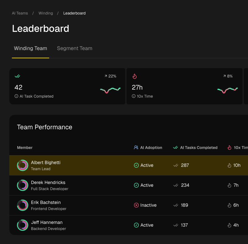
Using these agile development metrics together fundamentally changes the conversation. It moves from “Why can’t you go faster?” to “How can we clear these roadblocks so you can fly?” That’s a far more productive, empathetic, and ultimately, more effective way to boost performance.
Measuring Quality to Ship with Confidence
Moving fast is great, but shipping buggy software is a surefire way to frustrate customers and burn out your team. While flow metrics are all about speed, quality metrics are your safety net. They make sure that as you pick up the pace, you aren’t sacrificing the stability and integrity of your product.
Think of these agile development metrics as the bedrock of confidence for every single release. This isn’t about chasing some impossible standard of perfection. It’s about smart risk management and stamping out the kind of technical debt that can bring future development to a grinding halt.
Let’s dive into the key metrics that help you protect your product’s quality.
Code Churn: Uncovering Instability
Code Churn is a simple but powerful metric: it tracks how often code gets rewritten, changed, or even deleted shortly after it was first committed. You can think of it as the “rework rate” for your codebase. Now, not all churn is bad. Refactoring a clunky old module or tweaking a feature after getting some fresh customer feedback is healthy, productive work.
But when churn is consistently high, it’s a red flag waving in your face. It almost always points to deeper issues that need attention, right now.
- Unclear Requirements: If developers are constantly redoing their work, it’s often because the initial requirements were fuzzy or incomplete. They’re essentially guessing what’s needed, leading to multiple attempts to get it right.
- Technical Debt: High churn can also be a symptom of a fragile codebase. A small, seemingly innocent change in one place might cause a cascade of unexpected bugs elsewhere, trapping developers in a painful cycle of fixing and refactoring.
- Inadequate Testing: When your automated test suite is thin, developers push code that seems to work, only for users to find all the edge cases. This triggers a flurry of hotfixes and rework, which sends your churn numbers through the roof.
Looking at churn shifts the conversation from “why is this feature taking so long?” to “why did we have to rewrite this part three times?” It helps you diagnose the root cause instead of just treating the symptom.
PR Review Time: The Bottleneck You Can Control
Pull Request (PR) Review Time measures the clock from the moment a PR is opened to when it’s finally merged into the main branch. This isn’t just a number; it’s a direct reflection of your team’s collaboration health. A quick, thoughtful review process is a fantastic quality check. A slow, neglected one creates a massive bottleneck that tanks morale and stalls the entire delivery pipeline.
When PR review times start creeping up, it’s time to find out why. The goal isn’t just to force the number down—it’s to understand and remove the friction. A slow review process can point to a number of problems, from overloaded senior engineers to a team culture that doesn’t prioritize giving timely feedback. Shortening this feedback loop is one of the fastest ways to improve your team’s overall Cycle Time. For a deeper look, you can learn how to measure code quality with a more complete strategy.
A long PR review time is a tax on every single feature you ship. It introduces context switching, delays feedback, and turns a collaborative quality check into a frustrating waiting game.
Defect Escape Rate: Protecting Your Users
The Defect Escape Rate might be the most critical quality-focused metric of them all. It calculates the percentage of bugs that your customers find after a release, versus those you catch internally. A low escape rate is a clear sign that your internal quality processes—from automated tests to manual QA—are doing their job.
If your Defect Escape Rate starts to climb, you have a hole in your safety net. This metric forces you to be honest about your entire quality process. Are your automated tests covering the right things? Is your QA team getting involved early enough? Are you pushing features out the door before they’re truly ready?
Tracking this helps protect your most important asset: your users’ trust. A rising rate tells you it’s time to invest in your testing strategy before a critical failure makes it into the wild.
Comparing Key Quality and Value Metrics
To get a clearer picture, it’s helpful to see these metrics side-by-side. Each one tells a different part of the quality story, from the stability of the code itself to the effectiveness of your review and testing processes.
| Metric | What It Measures | Ideal Trend | Common Pitfall |
|---|---|---|---|
| Code Churn | The frequency of code being rewritten or deleted soon after creation. | Stable or decreasing | Mistaking all churn for healthy refactoring instead of seeing it as a sign of unclear requirements. |
| PR Review Time | The time a pull request waits for review and merging. | Consistently short | Focusing only on the number, leading to rubber-stamp approvals instead of fixing the underlying review bottleneck. |
| Defect Escape Rate | The percentage of defects found by users in production. | As low as possible | Blaming individuals for bugs instead of analyzing the systemic failures in the testing process that let them slip through. |
By balancing these quality metrics with your flow metrics, you build a development process that is both sustainable and resilient. You create a team that not only ships fast but ships with the confidence that their work will stand the test of time.
The Next Wave of AI-Powered Development Metrics
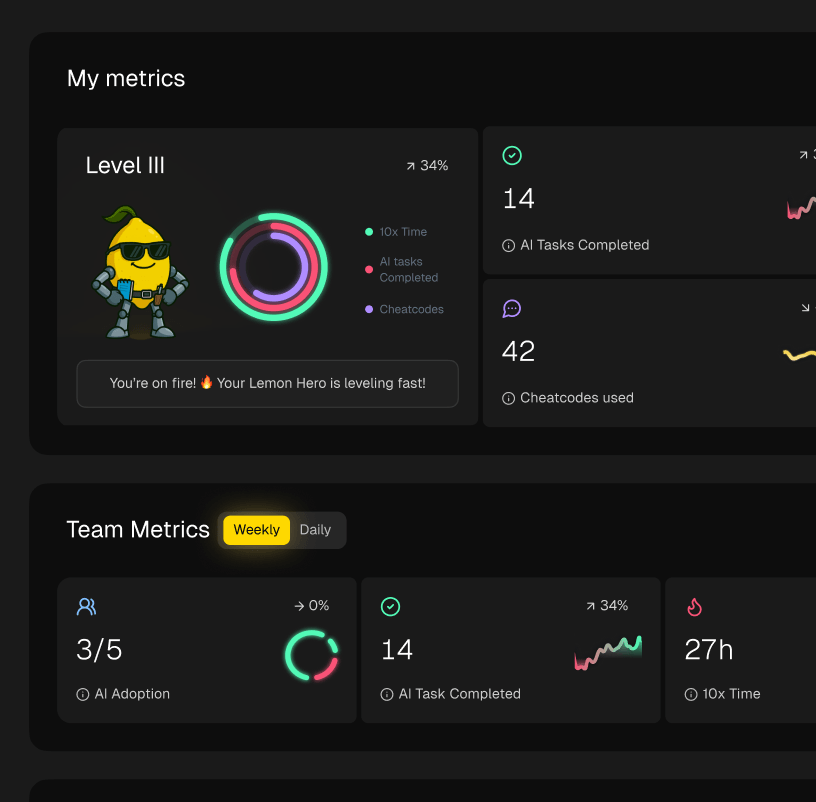
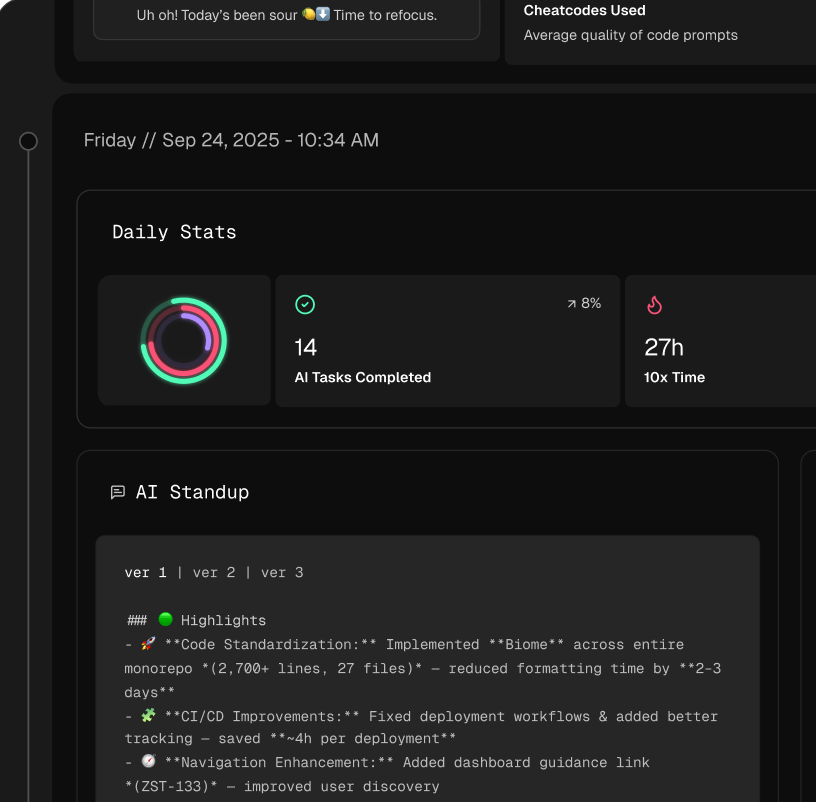
When you bring AI coding assistants into your development workflow, your classic agile development metrics start to miss part of the picture. Things like Cycle Time and Throughput are still essential, don’t get me wrong. But they can’t see the quiet, back-and-forth collaboration between a developer and their AI partner. To really get a handle on what productivity looks like now, we need a new set of metrics.

This next wave of metrics isn’t just about counting what gets done. It’s about understanding the process of coding with AI. It’s about making that invisible interaction visible so leaders can see not just if AI is being used, but how well it’s working.
AI Time Saved: Quantifying the Productivity Boost
The most straightforward way to see AI’s impact is by tracking AI Time Saved. This metric simply adds up the hours your developers get back by offloading tasks to AI—things like generating boilerplate code, writing unit tests, or refactoring a tricky function. It puts a hard number on the productivity boost you’re getting from your investment.
But “time saved” is more than just a number. It’s cognitive load lifted. It’s mental space freed up for your developers to tackle the bigger, meatier problems like system architecture and creative problem-solving. We’ve seen that developers often pour that extra time right back into the product, improving code quality and building out better test coverage. It’s a win that keeps on giving.
This metric helps answer the big question every engineering leader has: Is this expensive AI tool actually making my team faster?
Prompt Effectiveness: Measuring the Human-AI Dialogue
An AI assistant is only as good as the questions you ask it. That’s where Prompt Effectiveness comes in. This metric is all about measuring how clearly your team is communicating with the AI. It’s not about grading individual performance; it’s about understanding the quality of the “conversation” between the human and the machine.
When prompt effectiveness is high, it means developers are writing clear, context-rich prompts that get useful code back on the first or second try. On the flip side, low effectiveness—marked by lots of re-prompting or heavy edits to the AI’s suggestions—tells you there’s a skill gap that needs attention.
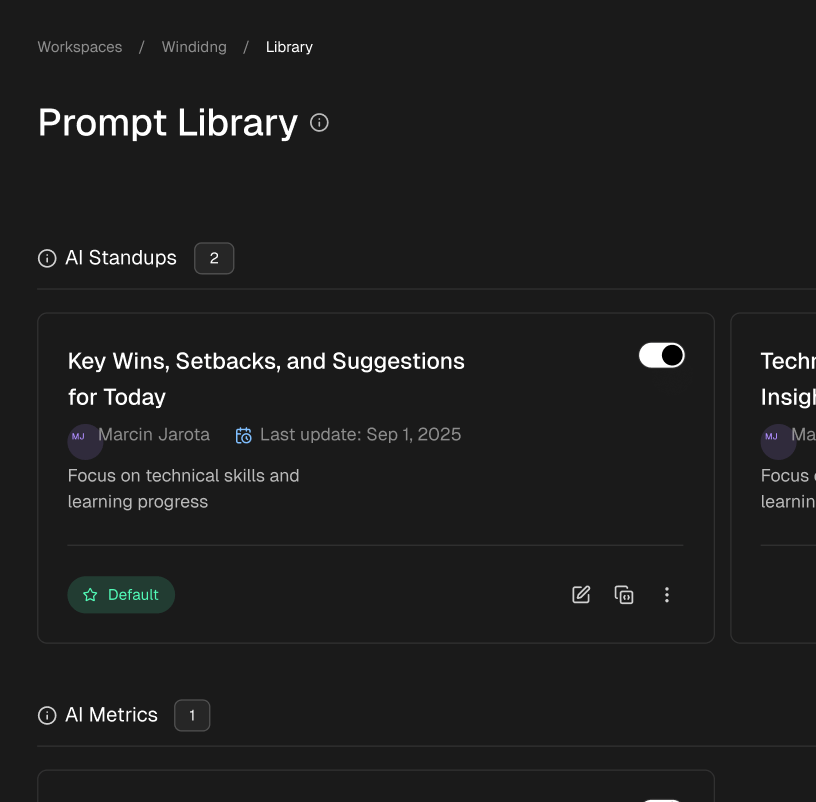
Tracking Prompt Effectiveness lets you spot what a great AI interaction looks like. You can then turn those successful prompting patterns into “cheat codes” or best practices for the whole organization, effectively scaling the skills of your best AI users.
Session Friction: Pinpointing Where Developers Get Stuck
Let’s be honest, not every AI interaction is a home run. Session Friction is a metric designed to find the exact moments a developer gets bogged down with their AI assistant. It flags those times when a developer has to spend ages editing AI-generated code, gives up on a suggestion completely, or gets stuck in a frustrating loop of re-prompting that goes nowhere.
Think of it as an early warning system for developer frustration. By highlighting these high-friction moments, you can see where the AI is actually getting in the way instead of helping.
This data is gold. It can show you:
- Tasks where the AI consistently struggles.
- Areas where your team could use more training on how to write better prompts.
- Opportunities to tweak your workflows to make AI a more natural fit.
Bringing these friction points out into the open turns a frustrating experience into a learning opportunity, ensuring your team gets the most out of these powerful tools. Moving forward, solid AI automation ROI tracking will be non-negotiable for understanding the true value of new tech. By combining these AI-native metrics with traditional agile ones, you get a full 360-degree view of team performance, allowing you to scale AI adoption with confidence and maximize its return.
Putting Your Agile Metrics into Practice
So, you know which agile development metrics to track. That’s a great first step. But the real magic happens when you move from simply knowing to actively doing—turning raw data into a real engine for continuous improvement. This is your playbook for making that happen.
The goal here isn’t to micromanage. It’s to build a culture where metrics give your team the power to improve on their own terms.

The trick is to start small. Don’t try to implement every single metric overnight. That’s a surefire way to overwhelm your team and create resistance. Instead, pick a few key areas to focus on, show some early wins, and build from there.
Start with One or Two Key Metrics
To kick things off, choose just one or two metrics that really get to the heart of your team’s workflow. For most teams, the best place to start is with Cycle Time and Work in Progress (WIP).
- Cycle Time: This metric cuts right to the chase—it tells you how long it takes to actually get work done. It’s a fantastic barometer for the overall health of your process.
- Work in Progress (WIP): Tracking WIP is your best tool for finding bottlenecks and seeing the damage caused by constant context-switching. Honestly, limiting WIP is often the single biggest improvement a team can make.
Focusing on just these two creates a really tight and actionable feedback loop. As soon as the team starts to lower their WIP, they’ll almost immediately see their Cycle Time improve. That’s a quick win that builds confidence and proves the value of the whole exercise.
Establish a Baseline First
Before you start changing anything, you need to know where you’re starting from. Let your team work as they normally do for a few sprints—or about a month if you’re using Kanban—and just collect the data in the background. This gives you a baseline, an objective snapshot of your current reality.
Without a baseline, you’re just guessing. Establishing one lets you measure the real impact of your changes and have data-driven conversations about whether a new process is actually working.
Once you have that baseline, any changes you see in your metrics will have context. You’ll be able to say with confidence, “We put WIP limits in place two weeks ago, and our average Cycle Time has already dropped by 15%.” Now that’s a powerful statement.
Communicate the “Why” to Foster Buy-In
How you roll out metrics to your team is absolutely critical. If it feels like a top-down mandate to watch their every move, you’ll get pushback and anxiety. The key is to frame it as a shared tool for solving problems together.
Be completely transparent about the “why”:
- Start a Conversation: Explain that these metrics aren’t about judgment. They’re about giving the team a clearer view of its own process.
- Focus on the System: Make it clear that the goal is to find and fix issues in the workflow, not to point fingers at people.
- Empower the Team: Position the data as something the team can own. It’s a tool they can use to experiment, see what works, and celebrate their own successes.
When your team truly understands that the metrics are there to help them succeed, they’ll stop being spectators and start being active participants. Data becomes a common language for making things better, transforming your metrics program from a source of stress into a catalyst for real, team-driven growth.
Common Questions About Agile Metrics
Diving into agile development metrics can feel like learning a new language. It’s natural to have questions, so let’s tackle some of the most common ones I hear from teams.
What Are the Most Important Agile Metrics to Start With?
If you’re just getting started, don’t try to track everything at once. You’ll just drown in data.
The best place to begin is with a handful of core “flow” metrics: Cycle Time, Throughput, and Work in Progress (WIP). Think of them as the three legs of a stool. Cycle Time shows you how long a task actually takes from “in progress” to “done,” Throughput tells you how many things you’re finishing in a week or a sprint, and WIP reveals how much you’re juggling at once.
Together, they give you a surprisingly clear picture of your team’s health without being overwhelming.
How Do You Prevent Agile Metrics from Being Misused?
This is a big one, and it’s all about culture. The moment metrics become a weapon, you’ve lost.
The absolute key is to make it clear that metrics are for understanding the system, not for judging people. Leadership has to champion this. The goal is to use data to ask better questions, like “It looks like our cycle time is creeping up, what’s getting in our way?” instead of making accusations like “Team A is slower than Team B.”
When you treat metrics as a flashlight to find bottlenecks, not a hammer to punish individuals, you create a culture of trust and genuine improvement.
How Do AI Coding Assistants Affect Agile Metrics?
AI tools are changing the game, and our metrics have to adapt. Traditional metrics like cycle time are still important, but they don’t tell the whole story anymore.
You need to add a new layer of AI-specific metrics. Things like ‘AI Time Saved’ help you see the actual productivity boost, while ‘Prompt Effectiveness’ tells you how skilled your team is at working with the AI. You also need to watch for ‘Session Friction’ to spot where the AI might be slowing things down. A modern workflow needs both.
Level Up Your Agile Metrics
Turn raw data into an engine for continuous improvement and team empowerment.
📊 Core Metrics
- Cycle Time — time from "in-progress" to "done"
- Throughput — number of completed work items per sprint
- Defect Escape Rate — percentage of bugs found by users post-release
🕹️ My Cheatcodes
- 🌱 Start with Flow — prioritize Cycle Time & WIP over Velocity for immediate insights
- 🦎 Context is King — always analyze metrics together to understand the full story
- ⚡ Measure the System, Not People — use data to fix process bottlenecks, not to rank individuals
📈 Reflection Points
- 💡 Are our metrics sparking helpful conversations or creating a culture of fear?
- 🧩 Are we balancing our need for speed (Flow) with our commitment to quality (Defects)?
- 📘 How are we measuring the real-world impact of our AI coding assistants?
Gallery
Lemon shots